In the fast-paced world of marketing, businesses are constantly seeking innovative ways to capture their target audience’s attention. One powerful tool that has been harnessed for ages is the use of colour in visual communication. The science of colour psychology delves into how different hues can evoke emotions and influence human behaviour. In banner printing, understanding the impact of colours is essential to create visually compelling and emotionally resonant designs. Let’s explore the fascinating world of colour psychology and its application in crafting effective banners that leave a lasting impression on consumers.
Understanding Color Psychology
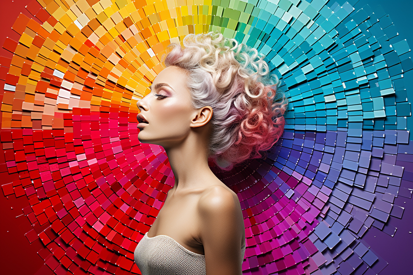
Colours are not merely a visual aspect; they have the power to evoke feelings and communicate messages subconsciously. The field of colour psychology studies how colours influence human emotions, thoughts, and actions. Different colours trigger distinct responses due to their associations with nature, culture, and individual experiences. As marketers, harnessing this knowledge can significantly impact the effectiveness of banner advertising.
The Emotional Impact of Colours in Banner Printing
Red: The colour of passion, power, and urgency. Red stimulates energy and evokes a sense of urgency, making it suitable for limited-time offers and sales promotions. It can also signify love and excitement, making it a compelling choice for event banners.
Blue: Often associated with trust, security, and tranquility, blue is a popular choice for corporate banners, particularly in industries like finance and technology. It can instil a sense of reliability and professionalism in the minds of consumers.
Green: Symbolising growth, nature, and health, green is perfect for banners related to eco-friendly products, health services, and environmental initiatives. It conveys a sense of freshness and positivity.
Yellow: Radiating warmth, happiness, and optimism, yellow can instantly grab attention and evoke positive emotions. It is ideal for banners promoting youthful and vibrant brands or summer-themed events.
Orange: Combining the energy of red and the cheerfulness of yellow, orange exudes enthusiasm and creativity. It is often used to convey a playful and inviting vibe, making it suitable for family-oriented events and entertainment promotions.
Purple: Associated with luxury, wisdom, and imagination, purple adds a touch of sophistication to banners. It appeals to artistic and creative sensibilities, making it suitable for artistic events and high-end products.
Black: Representing elegance, power, and authority, black is often used to create a sense of exclusivity and luxury. However, excessive use of black in banners may evoke feelings of darkness or mystery.
White: Symbolising purity, simplicity, and cleanliness, white creates a sense of spaciousness and openness. It is commonly used in healthcare and wellness banners, where a calming and serene ambiance is desired.
Using Colour Combinations in Banner Printing
While individual colours have distinct effects, colour combinations in banner printing can create a more profound impact. The choice of colour schemes can influence how the message is perceived and the emotions it elicits.
Complementary Colours: Complementary colours are positioned opposite each other on the colour wheel, such as red and green or blue and orange. Using complementary colour combinations in banners creates a high contrast that grabs attention, making the content stand out.
Analogous Colours: Analogous colours are adjacent to each other on the colour wheel, like blue, green, and teal. This colour scheme in banners creates a harmonious and pleasing visual experience, making it suitable for conveying a sense of unity and balance.
Monochromatic Colours: Monochromatic colour schemes involve using various shades of a single colour. This approach in banner printing creates a clean and elegant look, emphasising a specific mood or theme associated with that colour.
Triadic Colours: Triadic colours form an equilateral triangle on the colour wheel, such as red, yellow, and blue. When used in banners, this colour combination adds vibrancy and energy, making it ideal for celebratory events or youthful promotions.
Practical Applications of Colour Psychology in Banner Printing
Branding: Consistent use of colours in banners helps reinforce brand identity and creates a strong association between the brand and the emotions it seeks to evoke.
Call-to-Action: Colours can influence the effectiveness of a call-to-action in banners. For instance, using red or orange buttons for “Buy Now” can prompt a sense of urgency and encourage immediate action.
Target Audience: Understanding the preferences and cultural associations of the target audience is crucial in choosing the right colours for banners. Different cultures have varying interpretations of colours, and marketers should adapt accordingly.
Seasonal Campaigns: Adapting banner colours to align with seasonal themes can enhance relevancy and connection with the audience. For instance, warm tones for autumn and cool tones for summer.
In conclusion, colour psychology plays a pivotal role in banner printing, allowing businesses to tap into the emotional responses of their audience and influence consumer behaviour. From eliciting excitement through red to instilling trust with blue, the power of colours in banner advertising cannot be underestimated. By understanding the science of colour psychology and incorporating it strategically into banner designs, marketers can create impactful visual messages that leave a lasting impression on consumers and propel their brands towards success. Remember, a well-designed banner not only catches the eye but also speaks to the heart.